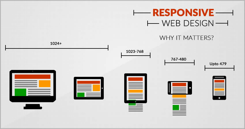
Today, due to the massive explosion in the technology, every individual has different preference on where they want to view their required information. So, a website design is only complete when your well managed content is responsive to all media screens and sizes. Wanting a mobile version of your website is more of a requirement than following a trend.
So, what is a responsive design?
Responsive design is one of the integral part of designing a website that makes your website more flexible towards a wide range of desktops to mobile devices. Making your website compatible to different media resolutions and sizes includes making sure the content, text, images, media, layouts are maintained.
Having a responsive website helps to boost your online presence and makes it more seo friendly. Also this leads to a great user browsing experience which could lead to increase in your website traffic.
As a creative web developer in Sydney, there are certain things that I have learned throughout my career.
And here I give you my personal guidelines for making a website completely responsive.
Using Media Queries
Media Queries is a great way to force fluid layouts of a website to adapt screen sizes of different available devices. It is a powerful tool that help enhance any reading experience for the visitor. Every new browser release supports the use of media queries in one way or another. Some of the older browsers like IE6 might not though.
There are two approach for using media queries; mobile first and desktop first. For mobile first, you will build a mobile layout first and then move towards the larger resolutions. Desktop first on the other hand will let you build your website in the desktop version first and gradually move towards the smaller device sizes.
Easy navigation
It is an absolute necessity to be able to navigate through the website easily no matter which page you currently are on. Different toggle and drop down menus could be used for responsive design so that your website will look slick and elegant. If putting navigation in every page is bothersome, it is wise to put at least the link of your home page.
Responsive text and images
Can text and images be responsive? Depends on how you use them. The typography used on the desktop version might not be that readable in the mobile version. So, concepts of responsive text are being discussed lately that will allow your content text to adapt to any screen size. Images on the other hand are a little tricky.
Due to the presence of width and height of the images working around them seems to be a little difficult. Tools like Adaptive images helps to automatically scale the images as per the screen size of the device that it has been viewed on.
Testing
You must always test your final website to see if it is actually responsive to all the available devices. You can manually test it on different browsers and devices. There are a lot of tools like Adobe Edge Inspect and Responsinator that will allow you to test your site’s responsiveness in different devices without physically owing any of it.
Wrapping it up, the importance of having a fully responsive website cannot be unseen. The rapid change in devices is compelling every individual to adapt their business website to become accessible in any format. Thus, it will be more appealing to its targeted audience.
Author Bio:
As a professional web designer of a renowned company, John brings his ocean of knowledge to the table. Devoted to writing as well, he loves to write about online marketing, design trends,and technological updates.


