Do you know why so many e-mail marketing campaigns fail? It is mainly because most marketers just send an e-mail to their prospects and hope for the best. Do not make the same mistake. Every aspect of your e-mail requires special attention. You need to perfectly craft every single bit of it, and it also includes choosing the most appropriate fonts, designs and colors for your e-mail.
It is true that the copywriting text of your e-mail holds the most value. However, at the same time, selecting the perfect fonts, designs and colors can seriously boost your e-mail response rate. In this article, we take a look at this very important, yet widely neglected dimension of e-mail marketing. More importantly, this article is well-supported by facts and proven test results, rather than personal opinions and views.
Selecting the Most Appropriate Font for Online Reading:
The study of typefaces tells us that every font brings something unique. Some are easier to read, while others are considered more powerful. In his famous book, Type & Layout, Colin Whieldon says:
“It is possible to blow away three-quarters of our readers simply by choosing the wrong type. If you rely on words to sell, that should concern you deeply.”
For printed materials and texts, almost every research proves that the serif fonts are much easier to read. For example Mr. Whieldon once tested with three different fonts for the same printed ad, that how many people easily read and comprehend the written text.
The test revealed that Garamond (a serif font) topped the results with 66%. On the other hand, Helvetica (a sans-serif font) was comprehended by only 12.5%. You can read more about the finding of Me. Whieldon here.
This result, however, was for the printed material. In case of e-mail marketing, the results are almost opposite. Various researches and studies claim that in case of online reading, Arial and Verdana are the most preferred and easily readable fonts. Shockingly, Times New Roman, which is one of the most widely used fonts, is actually the hardest to comprehend.
If we summarize some important researches and test results, we get that:
- For online, readers prefer to read the 12-point fonts.
- The 12-points are also faster and easier to read than the 10-point fonts, according to the studies.
- Anything smaller than the 12-point fonts, and the readers preferred Arial than many other available options.
- Verdana is another font that is considered highly readable and comfortable for the online readers – much more so than the Times New Roman.
There is actually another interesting research, which is related to the Verdana font.
A study indicates that at 12-point fonts, Arial is preferred over Verdana. However, as you keep decreasing the size of the fonts, Verdana appears to be more user-friendly. At 9-point each, Verdana was preferred over Arial by a margin of approximately 50%.
The Bottom Line of Font Selection:
The next time you send e-mails to your prospects, marketing different products and services, make sure to insert fonts that don’t make it too difficult for them to read and respond. Do not use Times New Roman. Instead, try using Arial or Verdana. Furthermore, the size of your selected font should ideally be of 12-point.
Ideal Designs – Why you Should Avoid the Reverse-Type Design in your E-mails?
As it is with different fonts, there are many researches and studies that claim that certain designs are more user-friendly and preferred by readers, while others aren’t.
A very common mistake is to use the reverse-type design. It refers to the design technique in which the background is darker than the text. Many e-mail marketers use this technique, but researches indicate that it is a mistake to do so.
Daniel Starch, the famous American psychologist and marketing researcher, conducted an experiment on the reverse-type design. In that research, he asked his subjects to read a non-reversed passage. The tested subjects read the passage at the average speed of 6 words per second. Daniel then asked the participants to read another passage – this time it was of the reverse-type design. The end-result showed the average speed of just 4 words per second.
As you know that the success of every e-mail marketing campaign is significantly dependent on the amount of time the readers spend on it. If they do not read it, you have absolutely no chance of selling your product or service. This study proved – and there are many other researches as well – that the reverse-type designs slow down reading. Not only that, readers particularly find it difficult to read, and in case of promotional e-mails, they often choose not to read them at all.
So in case of e-mail marketing, the tip is to avoid using the reverse-type design – which a lot of marketers still do use. Another tip is to use the white-space as much as you can, by way of wrapping. It not only increases the focus on more important things, but it also makes your copy look sleek, attractive and easy to the eyes.
For more design tips, check out this article about best practices of email design.
The Psychology of Different Colors:
As the white-wrapping is used for a specific purpose of drawing attention to important headlines, you can use every color to convey a particular message. Remember that each color has a unique personality and it conveys a particular message. These colors can influence and trigger human emotions in more ways that you can imagine. Use them appropriately to boost your e-mail response.
For instance, numerous tests were conducted to determine the most favorite color. The color blue turned out to be the most preferred one. You can use this fact to your advantage. People are automatically attracted when they see their favorite color. But do you know that the blue color automatically suppresses your diet? So if you are marketing for food items, you might not want to use this one. Instead, you can try using the color Red, which is the 2nd most popular color.
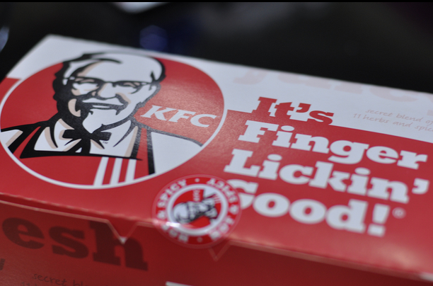
Did you ever wonder why so many food advertisements and marketing materials have red as their primary color? KFC, McDonalds, Pizza Hut, are only some of the big franchises that use red – but they never use blue. This color-policy is there for a reason. You should also be taking an advantage of it.
A KFC Advertisement Filled with Red as the Primary Color
Overall, this is called the psychology of different colors. The tip is to identify the best possible sets of color for your e-mail campaign and then use it to boost the response rate.
Final Words:
You see, fonts, designs and colors have a lot more value in your e-mail marketing campaigns. Your competitors might not be focusing on that, but you can. By paying enough attention to these aspects, you can significantly improve your e-mail campaigns and boost their response rate.
For more awesome e-mail marketing tips and tricks, stay tuned.
Featured images:
License: Image author owned
License: Creative Commons
image source
Hi there. My name is Eugene Krall, a guy who’s found himself somewhere in at the crossroads of SEO, social media marketing, programming and such. Hence, I like to talk a lot about the way all of these things work together. I work as a SEO-expert for the company specializing in developing email marketing software and providing email marketing services (Atompark), which pretty much makes me an email marketer myself. Interested in taking your email marketing campaing to the next level? Check out our products and get a 10% discount!


No Comments
Leave a comment Cancel