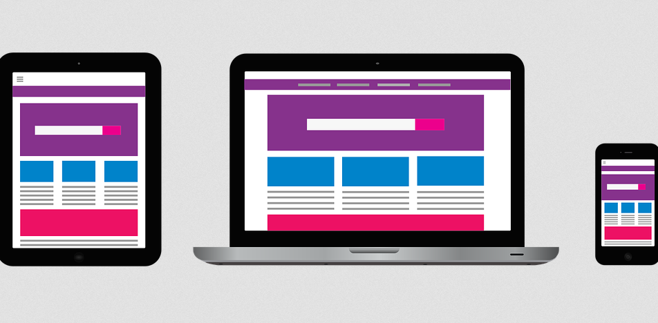
Creating a responsive website is like making a content that can be poured in all possible devices, easily taking up the shape of the device. We have many methods that can be used for designing a website and the responsive website designing is trending the market. A world where we can find a variety, needs a responsive website design that can have a hold on greater sections of the society.
As a child, you are always required to adhere to some of the do’s and dont’s instructions that your mother bombards on you when you are home alone so that you do not end up in any trouble. Talking about responsive website designs we have some do’s and dont’s that is sure to remind us of our mother’s instructions that helped us in staying out of dangers. The world wide web is not a bed of roses, you do encounter thorns in the way. These do’s and dont’s would help you to be careful with the thorns taking you to your destinations safe and sound.
The Do’s of responsive website designing:
Do keep in mind the type of audiences that will be accessing the website. Make a research as to how many devices will the website be accessed on. If you really find the number of audiences scattered with a variety of devices then only go for a responsive website designing and not because it is trending.
Do have an in-depth knowledge of the concepts and ideologies that support the responsive web designing concept. Master yourself with the tools and equipment that will make responsive web designing a fruitful journey in itself.
Do acquaint yourself with the in and out of the web designing concept so that you can create the best of results when it comes to creating a responsive website design. A website, when viewed on a desktop, has a different look and feel as compared to the look and feel that a website gives when viewed on a mobile phone. Make sure not to leave the creative element in the whole process of website creation.
The Dont’s of responsive website designing:
Do not ignore the font size when you are creating a website for the mobile devices. Keep the font size large enough so that they are legible when accessed on the mobile phones.
Do not forget to test the mobile responsive website before it is made live. It always a good option to recheck the work done so as to avoid embarrassment at a later stage.
Do not overindulge the creativity factor as there might be chances of the ruining the layout, draining out the audience;s attention. Make sure to keep the designs simple yet creative to hold the audience’s attention.
Do not overrule the contents of your website just because they need to be fitted in a smaller device. Make sure that all the important aspects of a content are given equal importance. It is always a good way to design content for a mobile first and then scale the designs according to the larger devices that are being used by the audiences.


No Comments
Leave a comment Cancel