The content on your website carries a heavy burden because it must perform several important tasks. Aside from delivering your message, it performs visual duties as well. Graphics and images aren’t the only visual components of web design, and the sooner you start thinking of content as a design element, the better.
Content has to draw the eye, look unique and make your message clear and easy to read, all at once. Google Fonts can either help in that regard, or draw you into a downward spiral of frustration, confusion, and lots of wasted time.
To ensure the latter scenario doesn’t happen to you, here’s a quick-and-handy overview of Google Fonts, complete with tips on how to use them to improve the user experience on your site.

Know Your Options
There are two primary types of fonts:
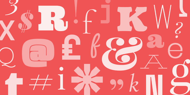
- Serif fonts. With their slight flourishes at the end lines of letters and numbers, these are considered most appropriate for print.
- Sans Serif fonts. Sans Serif (straight line letters without the flourishes) fonts are more easily read on web pages.
Within each category are several different designs of typeface.
The main thing to remember is to stick to Serif fonts for the best web page presentation for written content. Google Web Fonts (https://fonts.google.com/) is one of the more popular outlets for fonts, primarily because it is completely free to use and does not require that you have an account.
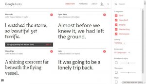
The site also allows you to search and type in example boxes in order to more thoroughly explore the look of the font for your content. Most fonts have several different styles within their type. You can mix and match for titles and content or buttons. Imagine a live-action font display window that shows how what you type will look in the font you’ve chosen. Pretty handy, and for font nerds, it’s pure joy to experiment with.
Use the Handy Cheat Sheet: Top Google Fonts
There are thousands of types listed and it could be easy to get confused if you don’t go to Google’s font site armed with a better understanding of which typefaces are most readable for websites. AWWWARDS, a magazine for designers and web developers offers a list complete with examples as well as instructions for downloading your selection. (https://www.awwwards.com/20-best-web-fonts-from-google-web-fonts-and-font-face.html) Each font selection listed on the site typically has several design options within the set.
Here are the top ten Google Web Fonts according to AWWWARDS. If you get stuck when choosing a font, just pick one from this list:
- Open Sans
- Josefin Slab
- Abril Fatface
- Arvo
- Lato
- Vollkorn
- Ubuntu
- PT Sans + Serif
- Old Standard TT
- Driod
The Golden Rule for Choosing Your Font
Remember, you’re going for optimal readability here. Being artistic should be far down on your list of priorities when choosing a font. A viewer will spend an average of about six seconds on a web page with written content. In order to maximize those precious seconds, the first step is to make sure the font you use is crisp, clear and easily read.
Explore and get a feel for what matches your personality or best represents the message you are trying to convey while remaining functional for the website.